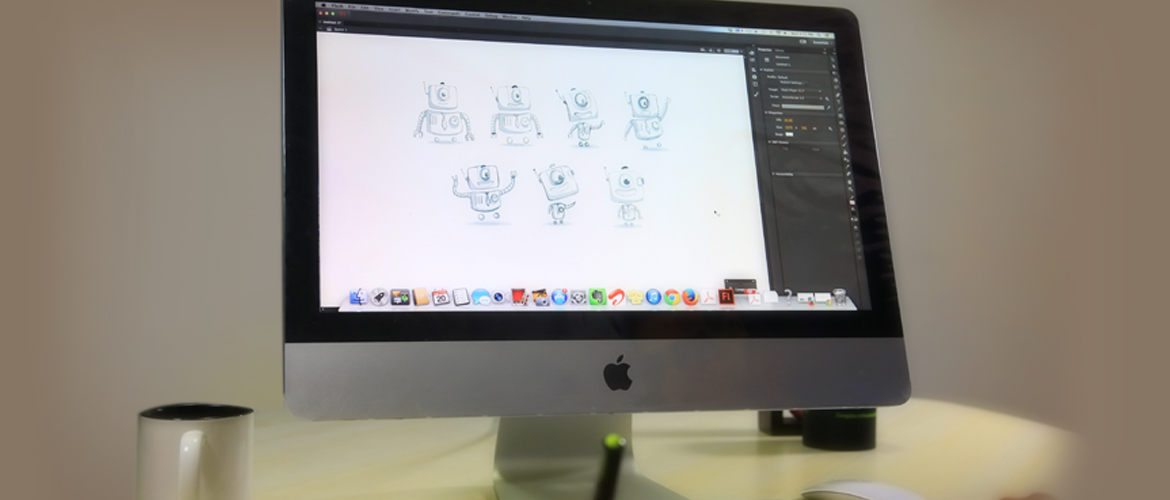
How to design a Mascot for Startups?
Have you ever wondered why the
Mascot of
McDonald strikes your mind like a bolt when you think of Mcburger? It's because their mascot has attracted you to the core that you might even dream of it while you are asleep.
Mascot is one of the best
marketing tools. It is the face of your startup's brand to the world. When a mascot is so important in churning out revenue for your business, the effort taken in designing a mascot should not be minimal. Everyone needs a mascot today to endorse their brand. But designing a mascot is not a hard nut to crack. You might have already come across various steps to create a mascot. So, we thought, providing an
insight into our
personal experiences would prove to be beneficial.
Think outside the Box
Arriving at a
concept that suits your business the best is the basic step when you are designing a mascot. Animaker is a
DIY video making app that brings
studio quality animation tools within the reach of everyone. So, once we understood the basic requirements, we turned our attention to animals that would reflect our brand in the most appropriate way. Guess what? We found something alarming, there was no animal left to endorse our brand. Every other animal had been used by some brand already.
(List of Cute Animal Mascot from hongkiat Blog) When a mascot is something that makes you stand out from the crowd, choosing an already used animal would be pointless. So with animals knocked out from our list, we wanted our mascot to signify something that could do
wonders of its own. So we narrowed our thoughts to a
robot and an
alien. There came a next hurdle knocking our doors. We saw that a few other brands had already used robot as their mascot. For example
Reddit had a simple alien as their mascot.
Alexis Ohanian founder of
Reddit, Bread-pig and
Hipmunk is a complete inspirational for anyone who creates Mascot design for their start-ups.
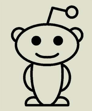 Credits : Reddit
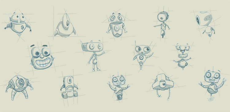
 So we started researching on how to make our robot different from the rest. Compared with others, our Mascot has to do lot more jobs than just getting displayed in a website or printing, it has to come in videos, must be easy to
animate, it has to
sing, dance, laugh and cry. OMG, it has to be a
“Rockstar”. Yet, it has to look
simple, less fancy and pleasing enough for kids in its
2D look.
It’s all in the eyes
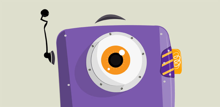
We were very keen on the point that our mascot must reflect what we do, with just a single look.
Eyes can communicate a wealth of
emotions. So we decided to have a single eye which is not scary but appealing.
Single eye gave that alien look to our mascot.
Brand characteristics
Animaker is a
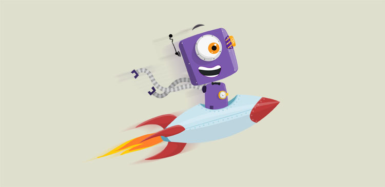
shockingly simple app but powerful enough to do some tough animation tasks. So we tried to inculcate simplicity in our mascot too. The arms were made flexible to show that Animaker is much
flexible and
user friendly. And we even added wheels in the place of legs to show how fast Animaker is.
Kid friendly
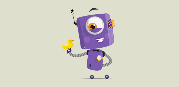
Usually when a kid likes something, everyone likes it too, but it’s not the same, it's the other way around. So we decided that our mascot must be
funny, pleasing, kiddish and
attractive. At the same time it must reflect our brand identity. So we designed Animaker mascot in a way that kids would love it to the core.
Colours speak all languages
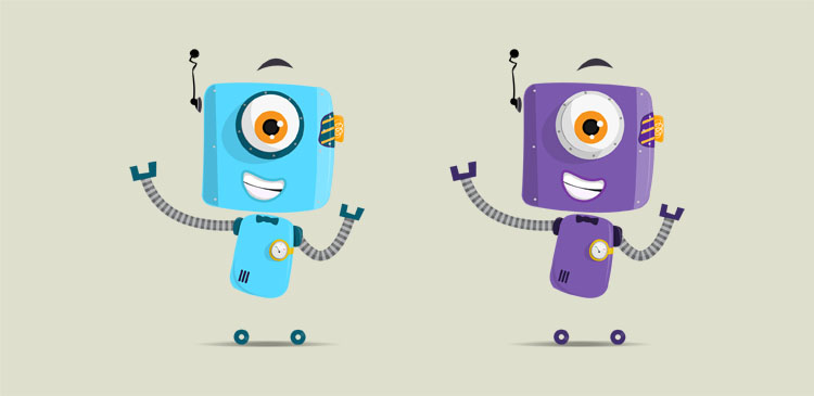
Adding the right colour is an important step. Each
colour has its own meaning. Animaker is basically associated with fun as it makes videos with lots of color and animations. We chose few colours that denoted
fun and
enthusiasm. At last we were in a dilemma to choose between the two colours,
Blue and
Purple. So, to make this interesting, we conducted a poll to see which colour wins.
Purple won the race by a very slight margin.
First impression is the best impression
A
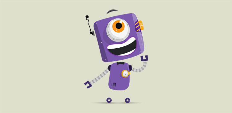
first look is very important for a mascot. We had designed the first look with a
“Hi” gesture to welcome any new users to the app. We also worked on some minute things that could add life to the robot like the
antenna and the
meter as its heart. In the later stages we appended a magician hat and a wand to the mascot to stress on the point that Animaker is a
magical tool that helps you
own your own studio.
Experimentation is essential
We had started the mascot design when the Animaker was in testing phase, so we had a good time on trying out different things, introducing inside the office, shared basic stickers to Kids, got direct feedback from top designers. Things we learnt out of this mascot design are ways to work agile, learning by doing and continuous improvement until you love what you have!
 Arriving at a concept that suits your business the best is the basic step when you are designing a mascot. Animaker is a DIY video making app that brings studio quality animation tools within the reach of everyone. So, once we understood the basic requirements, we turned our attention to animals that would reflect our brand in the most appropriate way. Guess what? We found something alarming, there was no animal left to endorse our brand. Every other animal had been used by some brand already. (List of Cute Animal Mascot from hongkiat Blog) When a mascot is something that makes you stand out from the crowd, choosing an already used animal would be pointless. So with animals knocked out from our list, we wanted our mascot to signify something that could do wonders of its own. So we narrowed our thoughts to a robot and an alien. There came a next hurdle knocking our doors. We saw that a few other brands had already used robot as their mascot. For example Reddit had a simple alien as their mascot. Alexis Ohanian founder of Reddit, Bread-pig and Hipmunk is a complete inspirational for anyone who creates Mascot design for their start-ups.
  Credits : Reddit So we started researching on how to make our robot different from the rest. Compared with others, our Mascot has to do lot more jobs than just getting displayed in a website or printing, it has to come in videos, must be easy to animate, it has to sing, dance, laugh and cry. OMG, it has to be a “Rockstar”. Yet, it has to look simple, less fancy and pleasing enough for kids in its 2D look.
 We were very keen on the point that our mascot must reflect what we do, with just a single look. Eyes can communicate a wealth of emotions. So we decided to have a single eye which is not scary but appealing. Single eye gave that alien look to our mascot.
 Animaker is a shockingly simple app but powerful enough to do some tough animation tasks. So we tried to inculcate simplicity in our mascot too. The arms were made flexible to show that Animaker is much flexible and user friendly. And we even added wheels in the place of legs to show how fast Animaker is.
 Usually when a kid likes something, everyone likes it too, but it’s not the same, it's the other way around. So we decided that our mascot must be funny, pleasing, kiddish and attractive. At the same time it must reflect our brand identity. So we designed Animaker mascot in a way that kids would love it to the core.
 Adding the right colour is an important step. Each colour has its own meaning. Animaker is basically associated with fun as it makes videos with lots of color and animations. We chose few colours that denoted fun and enthusiasm. At last we were in a dilemma to choose between the two colours, Blue and Purple. So, to make this interesting, we conducted a poll to see which colour wins. Purple won the race by a very slight margin.
 A first look is very important for a mascot. We had designed the first look with a “Hi” gesture to welcome any new users to the app. We also worked on some minute things that could add life to the robot like the antenna and the meter as its heart. In the later stages we appended a magician hat and a wand to the mascot to stress on the point that Animaker is a magical tool that helps you own your own studio.

