8 Creative Landing Page Examples You Need to Check out!
Landing pages for most startups, act as the face of their company.
As a marketer, it’s your duty to ensure that your website makes a mighty good first impression in order to convert a visitor to a paid user/customer quickly.
So it’s very important to get the ingredients right to cook up a killer landing page.
That being said, creating a high conversion landing page isn’t a cakewalk.
You have to get everything right - starting from the header copy, the design, the background images, the outline, and so on.
But the good thing is that we’re not in 1999 anymore and you don’t have to design landing pages right from scratch.
You can create one in minutes using either WIX or Unbounce. Both the DIY tools house 1000s of landing page templates for you to get started.
All you gotta do is check out the landing pages of other players in the industry, analyze what they have done right, improve the idea and apply it to your own landing pages.
In this article, I’ve highlighted 8 different landing pages you can get inspired from. I have also included my 2 Cents for each of the landing pages so that you’ll know which of the takeaways will be worthwhile to model after.
Here goes:
#1. Draw Comparisons
Comparisons have the unique quality of helping people make better choices. Adding a simple comparison of how your product solves problems vs other products might be enough to push users to make the right decision.
The customer messaging platform,
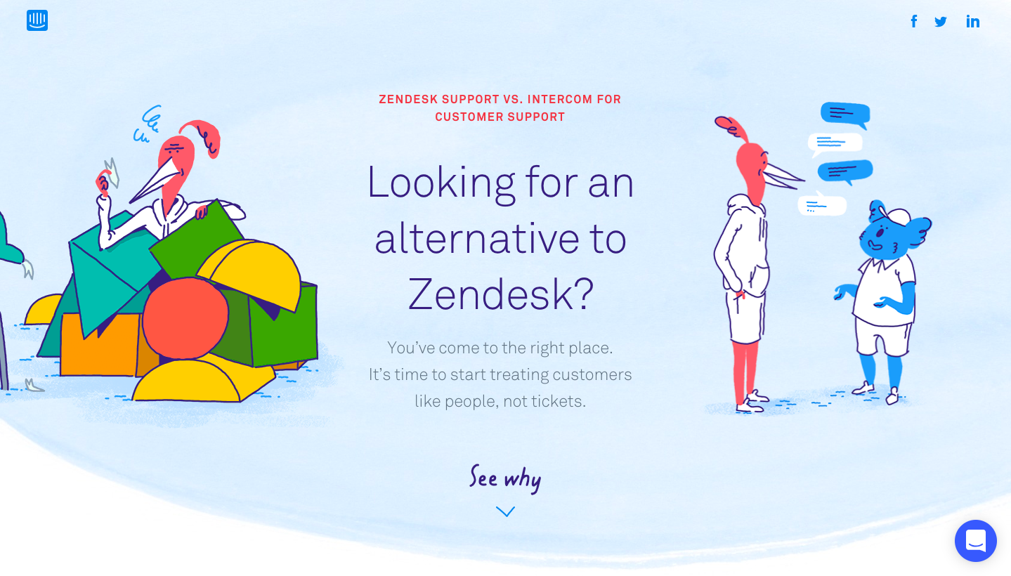
Intercom is a great example of a simple page that can provide great results. While their page has simplicity at its core design philosophy, it doesn’t come in the way of making their page more attractive than their competitor’s page.
With simple illustrations right at the top of their page, comparing customer support with and without intercom, they make a solid point on why customers should choose Intercom over Zendesk. A landing page with similar characteristics can instantly strike a chord in the visitor’s mind.
#2. Build a personality around your product
Adding a personality and some unique characteristics to your landing page will help build a personal relationship and rapport with your visitors.
Popular
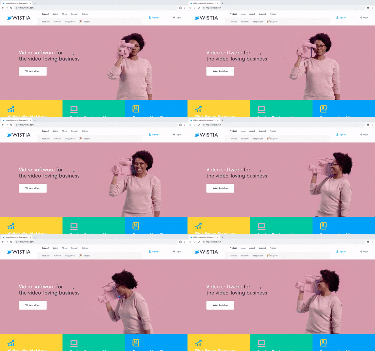
video-hosting site Wistia’s home page is a great example for a landing page with personality.
The main headline copy and the smiling woman who is dancing & holding a camcorder on her shoulder just compliment each other. I bet people won’t forget this page that easily.
#3. Add Demo Animations
Adding demo animations are a smart way to showcase the ease-of-use of your product. Combine the animations with clear USPs & clean CTA buttons and you will see conversions like never before.
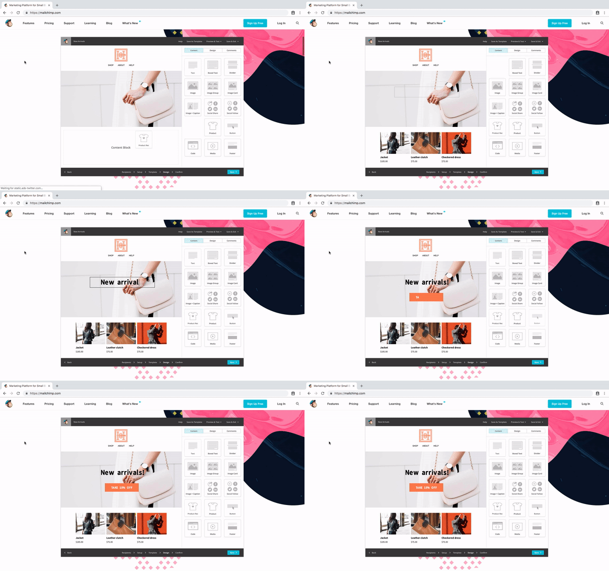
MailChimp would make a great example in this scenario. The popular email-marketing service provider has included a simple animation of how their campaign builder works just below the main CTA of their home page.
This coupled with the USP of the application showcased at different sections of the page with separate CTA buttons is compelling enough for visitors to click on the sign-up button.
#4 Use Typography animations
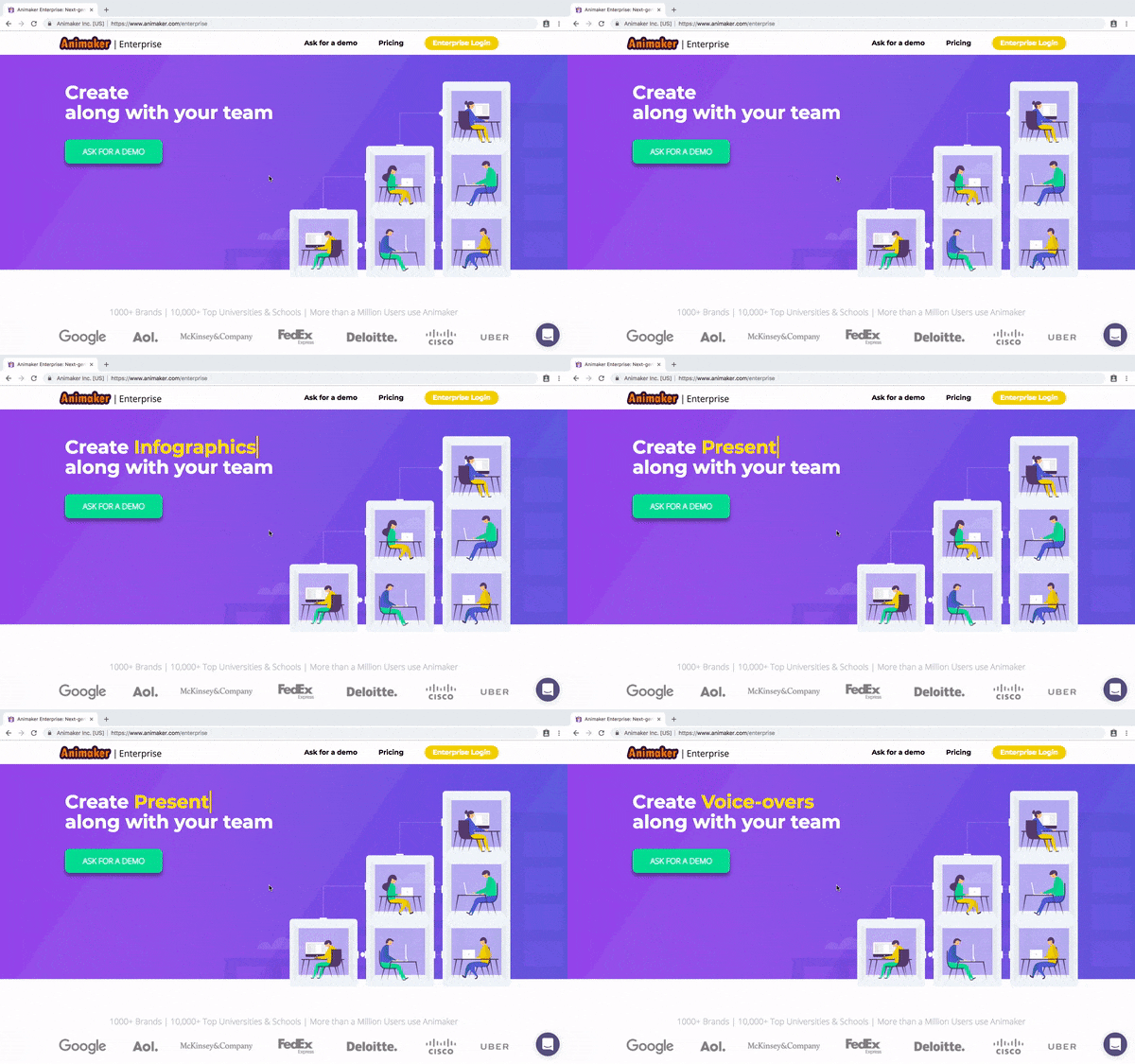
Typography Animation works best when you want to attractively convey different USPs with limited space on your landing page.
These moving texts are sure attention grabbers as they are more powerful than a static text message. This ensures that your audience easily understands the USPs of your application.
We have employed this hack in our very own
Animaker Enterprise home page and as a result, we even witnessed that people are clicking on the CTA button more than ever before. :)
#5. Take advantage of Chatbot first landing pages
No! I am not talking about the chatbots which are in the live chat window on the bottom of the landing pages. I am talking about an interactive landing page with a chatbot right at the center conveying your company’s offerings.
I came across
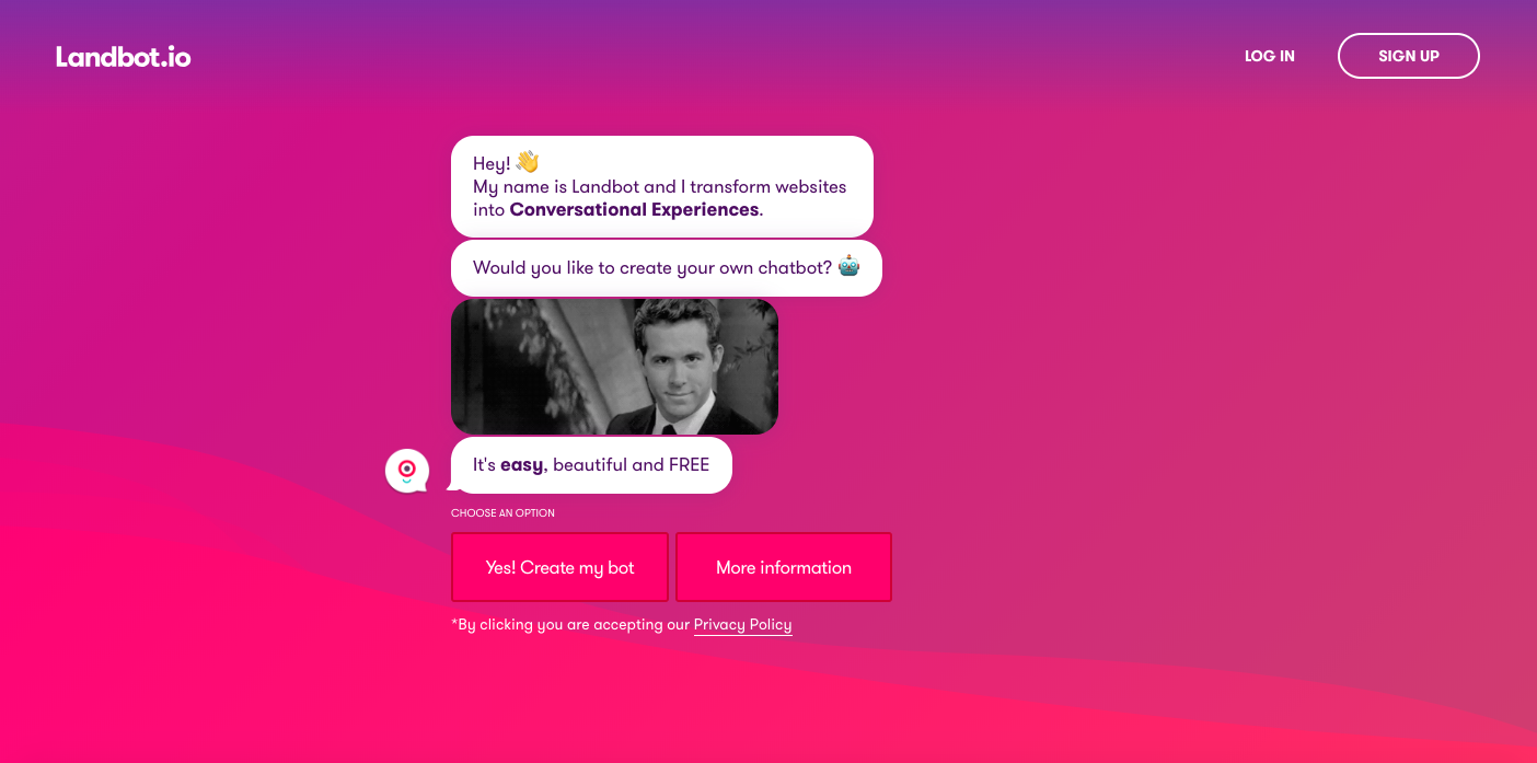
Landbot.io on product hunt. The unconventional page comes with a chatbot which delivers the USP of the site via interactive responses.
This is one of those sites which you have to try it to believe it. The site is just fun to use and it even starts with a different conversation when you return for the second time.
The best part is that you can create your own chatbot for your landing page using this website. Quite an eye-opener. Isn’t it?
#6. Use Simple Illustrations
Animations are impactful marketing tools. However, using more animations can affect the loading time of your landing page due to its file size and can, in turn, affect its SERP ranking too.
In such cases, using a simple cartoon or illustration of how your product can solve your customer's problems will do just the trick.
Check out
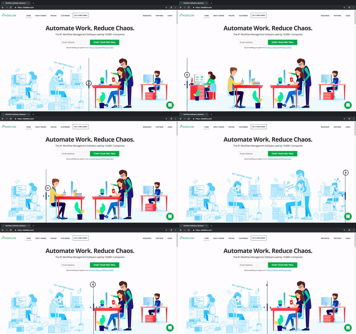
Kissflow’s landing page. They have a very simple illustration which explains how their product can actually reduce chaos and automate workflows in an enterprise environment. The slider in between makes it compelling to interact with the page.
#7. Leverage Pain Points
There are many sites which talk about the pain points of the customer and then tell about how they can solve them.
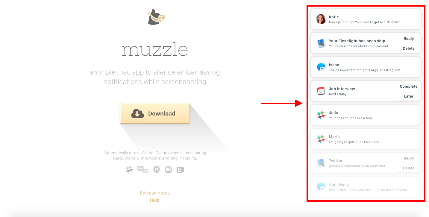
But, none have executed this idea in a way that Muzzle has done. It’s basically a simple app which allows Mac users to mute notifications while sharing screens with a colleague or a prospective client. It just helps avoid embarrassing situations during the screen sharing session.
Once you go onto
Muzzle app’s landing page, the page throws a series of notifications similar to what you see on Mac OS. This content of the notifications helps visitors have a first-hand experience of the awkward situation they might face if they had been sharing the screen at that moment.
They have cleverly put together the problem and the solution on the same page. Some of the notifications are just too damn hilarious. The site even got a quite a bit of media attention just because of the innovative and engaging design.
Now isn’t this a convincing proof that a good landing page can not only land you a few customers but can also get you some much needed global reach?
#8. Use video loops
The sole purpose of a landing page is to convince & convert your audience. The presence of a product/service explainer video is only going to make this process easier.
That being said, you should also ensure that the visitor watches the explainer video on your site but having a static thumbnail for the video will not do much good.
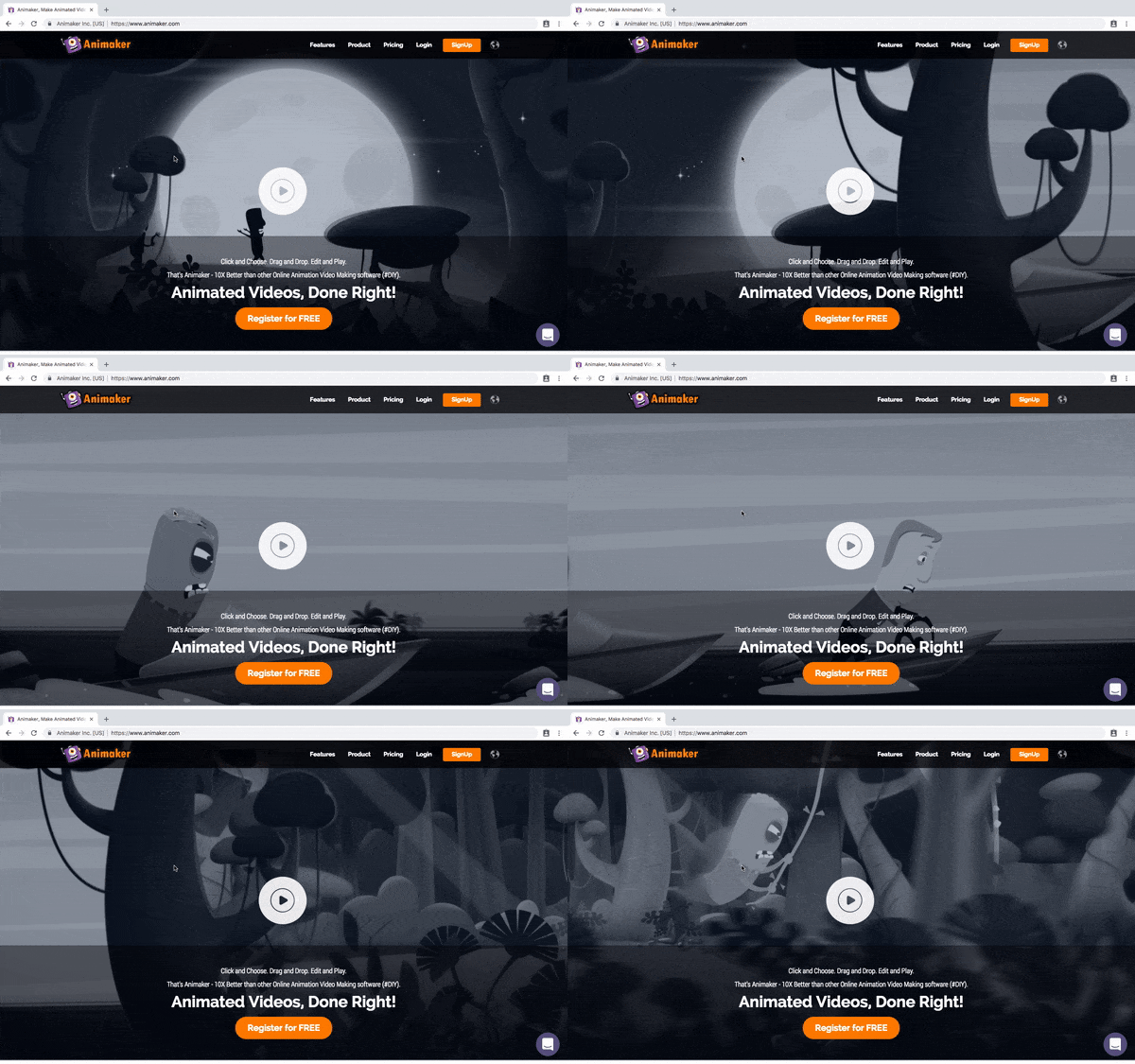
Alternatively, you can create a 10 - 15 sec
loop video of key scenes from your explainer video and have it run in your Landing page’s background. This immediately engages your audience and forces them to click on the play icon.
We follow this tactic for all of our own landing pages too and recorded more video views on our pages.
Bounce Tip:
#Make Use of QR Codes:
The main goal of a landing page is to convey a certain amount of information in the clearest format to convert visitors into successful prospects. But what if you have multiple different user journeys to pursue through a single landing page?
This is possible if you leverage QR codes for your landing page campaign. You can add it to your product packaging, on your social media handles, or as a part of your newsletters. You can then use these QR codes to redirect visitors to sign up for offers, submit their reviews, and/or visit the website. You can give the users the relevant options for the same. Beaconstac’s customized QR code landing page lets you create landing pages from scratch or you can choose from the listed templates. You can monitor the number of scans, the location of scans, and the devices used by using Beaconstac's trackable QR codes.
By integrating with Google Analytics, you can further refine your analysis and learn more about your landing page's users' demographics and browsing habits.
Though landing pages are not a ‘One size doesn’t fit all’ solution, these 8 creative hacks will inspire you to create a killer landing page and take on the world.
Have you come across any other creative landing pages? Do mention them in the comment section below. Let’s keep the list growing.
